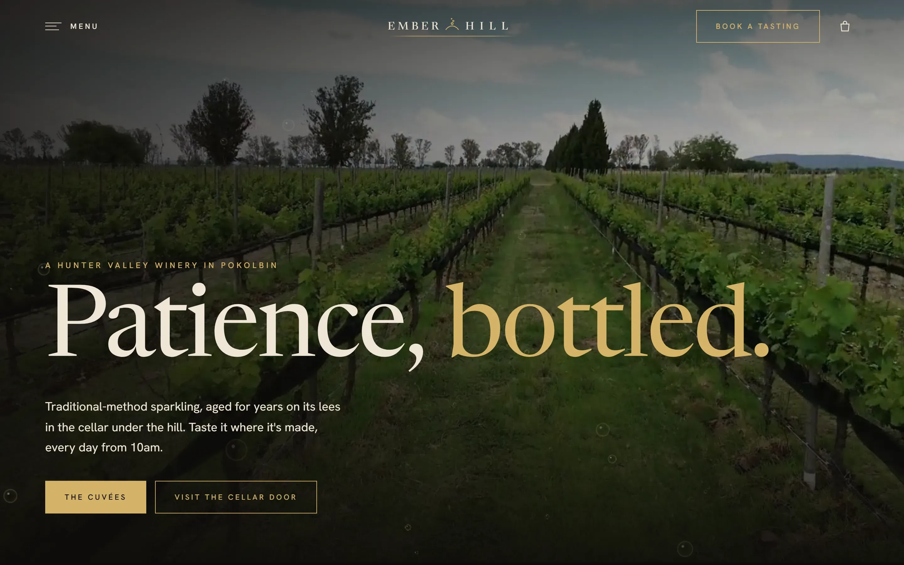
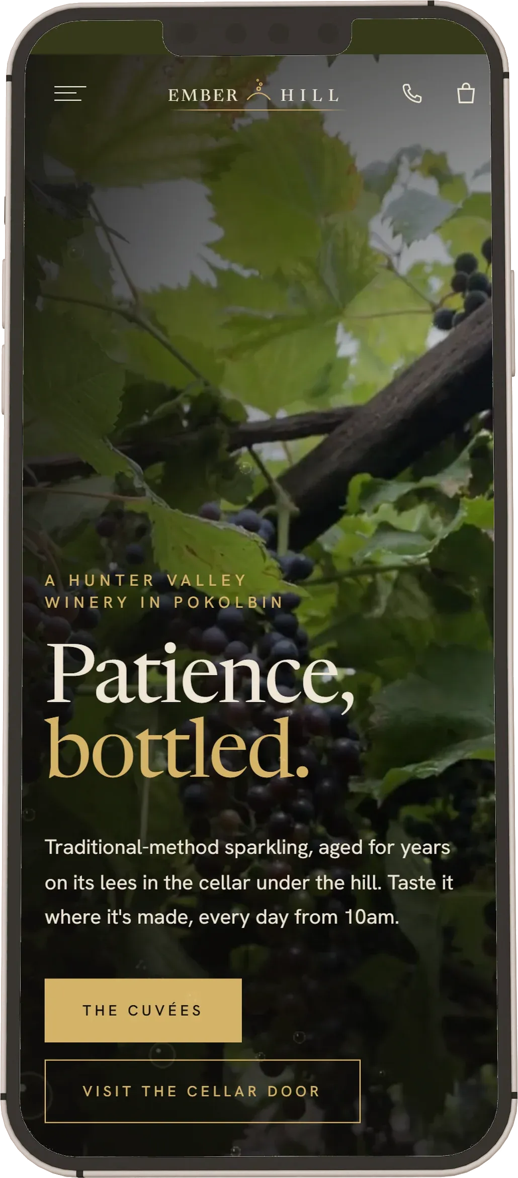
Fifteen films, and still scores 99 on a mobile speed test!
Fifteen pages open on their own full-screen film: the home page, the visit and experiences pages, the four cuvées and the page that lists them, the restaurant, weddings, the club, the story, the vineyard, the contact page and the front of the journal. Each one is a slow montage cut from the vineyard, the cellar and the glass, with a landscape cut for computers and a portrait cut for phones, and it loops with no visible join. Only the seven journal posts open on a still photo.
That much video usually makes a site slow, and this one scores 99 for performance on a phone in Google's PageSpeed test. Each page opens on a still frame from its film, so it is on screen straight away. The film loads only once the visitor first scrolls, taps or types, then fades in over the still, and a phone set to save data or show less motion keeps the still.
The movement runs on GSAP, the animation library, with its ScrollTrigger plugin for everything tied to the scroll, and Lenis, which smooths the scroll itself on a computer so the drifting photos and headings glide rather than jump. Both add weight that usually slows a site down. Here they load the same way as the film, after the first scroll, tap or key, so none of that weight sits between the visitor and the first screen.
The brief
Dark, unique and bespoke, with something to catch the eye on every scroll. The ground is a warm near-black, the type a high-contrast serif in cream, and the one accent is the pale gold of a glass of blanc de blancs, with a blush pink kept for the rosé. Every main page has its own full-screen film, cut from the vineyard, the cellar and the glass, and the logo is a small arc of hill with a bead of bubbles rising from it.
The wine is always "traditional-method sparkling", never the name of the French region it is made like, which an Australian label can't use. The footer carries a liquor licence line, a dummy number on the demo, and the under-18 notice, the way Hunter wineries that sell online print them.
What's on the site
- Four cuvée pages, from the Blanc de Blancs to a Late Disgorged, each with a tasting note, its time on lees, the dosage, what to eat with it and a price.
- A cart that slides in from the side, shows the freight terms, asks for a date of birth to confirm the buyer is 18 or over, then hands the order on: on a live build that is the winery's own shop system, such as Commerce7, Shopify or OrderPort.
- A visit page and four cellar door experiences, from a $20 tasting to a disgorging masterclass, each with its times, group size and price.
- A restaurant page with a set menu and a matched-wine price, a weddings page for the chapel in the vines, and a wine club with three tiers.
- An owner's story, told in a handwritten letter, and a vineyard page on how the wine is made.
- A journal of seven posts on what visitors ask before a trip, from choosing a wine tour to a day trip from Sydney and bringing the dog.
- A booking form in four short steps that arrives filled in from the experience you picked.
It is built the way we build any custom website: every fact, price and time is kept in one place and read by every page that prints it, so the tasting fee can't say one thing on the visit page and another in the booking form.
How it moves
Click a link and the page closes in a grid of dark squares, spreading out from where you clicked, then opens again on the next page. Behind everything, bubbles rise and wobble the way real bead does in a glass. Headings rise out of their lines as you reach them, and photos drift inside their frames and dissolve into the dark rather than ending on an edge.
On phones and tablets the scroll-driven movement is swapped for motion that plays once: each heading line rises out of a thin gold rule, and the gold words arrive letter by letter. Nothing moves until the visitor first scrolls, taps or types, and a visitor who has asked their phone for less motion gets every page finished and still, with nothing hidden.
What it scores
Google PageSpeed Insights, mobile, on the live demo home page, 29 Oct 2026: performance read 99 on four runs. That is with a full-screen video hero, the bubbles and the page transitions, on a phone.
Why SEO says 100 here and less on the live demo. Ember Hill isn't a real winery, so the demo carries a noindex tag: it tells Google not to list the site, and it never competes in search with a real cellar door. PageSpeed marks that one tag down, because on a real site it would be a mistake. Switch the tag off and SEO scores 100: we tested the home page, the contact page, a cuvée page and a journal post that way on 29 Oct 2026, and all four came back 100.
Built to be found
Every page was given its own search term before a word was written. We researched what people search for when they plan a Hunter Valley trip, then gave the main terms to the pages that bring a visit: the cellar door, the tastings, the restaurant and weddings. The journal takes the questions asked before the trip is booked. No two pages compete for the same search.
What we'd ask a client to shoot
On a real build these come from the winery itself, and its own cellar, people and light are what sell it. For this demo they are stock film and photos and generated bottle shots.
- Slow film of the vines at first and last light, and of a glass being poured, bubbles and all.
- The cellar: bottles in the riddling racks, the dark, the barrels.
- Each wine as a clean bottle shot against the same backdrop, so the range lines up.
- The cellar door with guests in it, and a tasting flight from above.
- Plates from the restaurant, and the venue dressed for an event.
- The owner and the winemaker, at work rather than posed.
More designs
Corella Painting, the house painter, Fernline Landscapes, the landscaper, Marram Hair, the hair salon, Tallowood Electrical, the electrician, Wattlewater Plumbing, the plumber, Stillwind Air, the air con business and Glenrock Support, the NDIS provider are the others. Every starting design is on the website examples page. A design like this can be built as any of our three packages: The Starter at $1,800, The Growth from $3,500, or The Authority; the details are on the packages page.