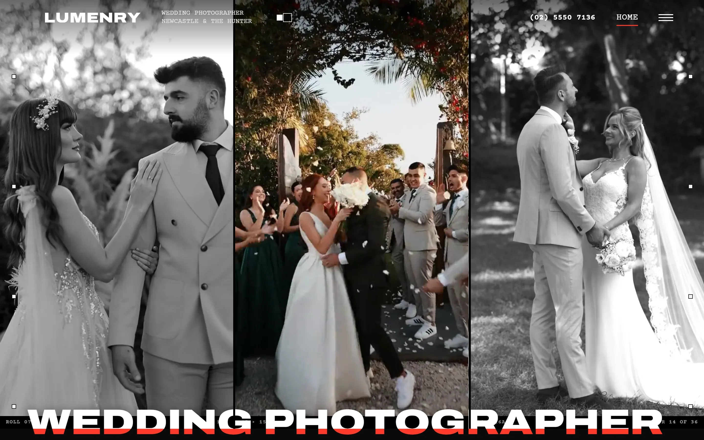
The brief for Lumenry
A darkroom and a roll of film. The site is black by default, with a switch in the header to turn it white, and the only colour that isn't a photo is a grease-pencil red, the kind photographers use to mark the frames they want on a contact sheet. The headings are set wide and heavy, and the small type is the typewriter face you'd find printed along the edge of a film: frame numbers, roll numbers, the date.
The site shows no prices. Wedding photographers price each day to the couple, so the collections page sets out what each package includes, and the enquiry form asks for the date and the place first.
What's on the Lumenry site
- A page each for weddings, elopements and engagements. On the weddings page, a strip of film runs through a wedding day frame by frame, from getting ready to the last frame of the night.
- An elopement countdown: type in a date and it works out when the notice of marriage has to be lodged (at least a month before, and no more than 18 months), with the sunset time at four places to say your vows.
- A what-to-wear test strip for engagement shoots: each of you picks a colour, and the strip shows how the two of you will print in black and white, and warns you if you'll merge into one grey.
- Four collections laid out like a photo lab's order sheet, with ticks for what's included and no prices.
- A portfolio of 36 prints laid out on a light table, with a magnifying loupe that shows each one in colour.
- Four area guides. Newcastle is a guide to ten real wedding venues. The Hunter Valley has a clock that works out sunset and golden hour for each month. Port Stephens has a compass that shows which way each beach faces at sunset, and the Central Coast has a tide window for the rock platforms.
- Sixteen suburb pages and eight pages on favourite venues, each written for that place: where to stand, what the light does, what to plan for.
- An enquiry form made like a save-the-date card. The date you pick is stamped across the top.
Why suburb and venue pages? When a couple searches "Peterson House wedding photographer", Google looks for a page about photographing a wedding at Peterson House. The venue pages are written as the photographer's favourites, never as weddings they've shot there, because Lumenry is made up. On a real photographer's site they'd be the venues they actually know.
How the Lumenry site moves
On the home page, a print of a wedding splits down the middle and opens to show the three services. Further down, the Lumenry name is cut out of the page with a drone film playing through the letters, and on a computer it grows as you scroll until the film fills the screen. Squares like the holes along a roll of film run down both edges of the page, and between pages a camera shutter closes and opens.
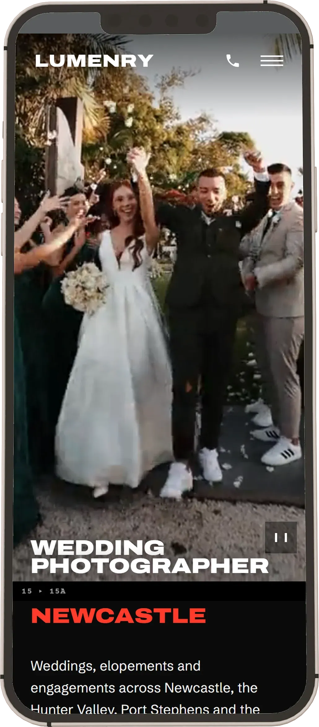
On a phone the same pages are calmer. The home page films take turns, one at a time, with a pause button on the film, and the film-roll squares and frame codes are left off so the photos have the screen. If someone has set their phone to show less motion, every page appears finished and still, with nothing hidden from them.
What Lumenry scores on Google's tests
These are the five scores from Google's free PageSpeed Insights test, run on a phone setting against the live home page on 3 Nov 2026. Each is out of 100. When we tested 736 small business websites across Newcastle, Lake Macquarie and Maitland in 2026, the typical one scored 57 for speed. This one scores 99, with three films on the first screen of its home page.
Performance is how fast the page loads and becomes usable. Accessibility is how well the site works for people with poor eyesight or who use a screen reader. Best Practices checks security and up-to-date web standards. SEO checks the basics Google needs to understand and list a page. Agentic browsing is a newer check of how easily AI assistants can read and use the site.
Why SEO says 100 here and less on the live demo. Lumenry isn't a real business, so we've asked Google not to list it in search results. That way it never competes with a real photographer. Google's test sees that request and marks the SEO score down, because on a real business website it would be a mistake. With the request switched off, the site scores 100 for SEO: we tested the home page, an area guide, a venue page, a suburb page, the elopements page and the contact page that way on 2 November 2026, and all six came back 100.
Built to be found for wedding photographer searches
Before a word was written, we looked at what couples actually type into Google when they're looking for a wedding photographer around Newcastle, the Hunter Valley, Port Stephens and the Central Coast, and gave each page its own phrase to aim for. The most-searched phrases went to the pages that win bookings: the home page, the services, the area guides and the venues couples search for by name. Because no two pages chase the same phrase, they never compete with each other in Google's results.
Photos and film we'd ask a photographer client for
A photographer is the one client who already has the best photos of their own work. For this demo we used licensed stock photos and film. On a real build, we'd ask for:
- The 36 frames they'd most like a couple to see, at full size, for the portfolio's light table.
- Three short upright clips from real weddings, ten seconds or so each, for the home page films.
- A drone pass over a venue or a stretch of coast they love, slow and steady.
- A favourite frame from each venue and suburb they want a page for.
- Themselves at work, if they're happy to be seen: camera up, mid-ceremony, from behind the couple.
More starting designs to compare with Lumenry
Tallbeam Building Co, the builder, Ember Hill, the Hunter Valley winery, Corella Painting, the house painter, Fernline Landscapes, the landscaper, Marram Hair, the hair salon, Tallowood Electrical, the electrician, Wattlewater Plumbing, the plumber, Stillwind Air, the air con business and Glenrock Support, the NDIS provider are the others. Every starting design is on the website examples page. A design like this is built as The Growth, from $3,500, or The Authority. If 3 to 5 pages will do, The Starter gets a design of its own, made for your business, for $1,800. The details are on the packages page.